Friday 15 December 2017

Making progress on the website

Today I made some intense progress on our website:


I had to change the menu to be horizontal rather than vertical because it wouldn't show up on other peoples computers and on mobile devices.


I also changed the font of the 'about me' paragraph as I thought it would be better to keep to one font for the whole website.


I inserted the video that I created on iMovie as a GIF in the videos tab to make it more visually pleasing as a tab.


I then inserted the merchandise I created in Photoshop into the 'Merch' tab with prices and titles. I'm not sure about the background image but it will do for now.

Thursday 14 December 2017

Creating GIF for website

In a website I created for practice purposes, I downloaded a video for the background of the website page. For our website, I wanted the 'Videos' tab to be more visually stimulating so created a GIF on iMovie for it. Here it is:


I will be placing it in the background of the videos tab soon. It was really easy to create, I just downloaded the video off YouTube and cut the part with just the shadows. It loops automatically, so will look seamless on the website.

Tuesday 12 December 2017

VIDEO UPLOADED!!!

Today, on December 12th, our music video was uploaded onto YouTube on Hurtwood House Media:


I am so happy with the outcome of the video and can't wait to see everyones reactions!

Friday 8 December 2017

Album Digipak Draft

Miranda was in charge of doing the digipak, so started to experiment with layering some of the portraits we took of Honor in Photoshop. I really liked the effect of this, even though you can't really see her face, it still gives her a star image. Miranda also added a little Venus symbol in the top right-hand corner, but as a group, we did not like this, so we agreed to call the album Venus, to connote femininity and foretell the ending of the music video.


At first, she went through all the images and opened up the ones that were similar and double exposed them to create a glitchy effect. She duplicated the first layer so she could return to the base, then added 3 layers on top. She saturated the colours to make them look more eye-catching. She also adjusted the opacity of each layer, allowing it to give off the effect we were looking for.


^^^ This is what the album cover will look like! ^^^

Website Update

Hope has made some impressive progress on our website:


The website currently looks like this, it has changed a lot from the beginning and we are very happy with it. We used a picture we took during the photo shoot and chose this one particularly because it is a very powerful, statement picture. The light upon her face makes a perfect first image to see when you click on the website. Having the menu bar on the side is sticking with the conventions of similar websites.


The about page is for fans looking at the website to find out more about her. We added a portrait picture of Honor to show more of her as the first image you see of her she is covered by her hair. Underneath the description, there is a video of the rough cut and once our music video has been edited and uploaded, it will be placed there.


The 'photos' tab on the website mainly consists of the photo shoot pictures, and Hope will be adding these pictures to her social media sites as well.

Friday 1 December 2017

Photoshoot pictures (my favourites)

Here are the pictures I took of Honor on the day:


Here are a series of pictures that Miranda did:


Overall, I love the pictures outcome! The lighter pictures I feel will be more orientated to the website rather than the album cover. In the last section of pictures, bottom right, this is one of my favourites to go on the front cover of the digipak.

We instructed her to act as natural as possible. We got her to turn her back to us and then look at us, giving the exact image we want from the mock-up digipak.

We asked Honor's opinion on the pictures and she thought that they were really good and fitted with the theme of the video.


Thursday 30 November 2017

Shooting for our CD digipak

Today we took some CD digipak photos with Honor. We set up the studio in the photography room so that two lights were flashing at the same time with coloured gels over them. We are keeping to the colour scheme of pink and blue, as there wasn't a pink gel, we had to suffice with red.

This was the set up:


Honor did an amazing job, she was very professional within the process and made the shoot day much easier.


As well as taking pictures for the digipak, we also took some pictures that can be used for our 'Photos' tab on our website.


Overall, I am so happy with the pictures we got. We had a mixture of black and white backgrounds and the coloured gels just made it x10 better.

Wednesday 29 November 2017

Audience feedback from rough cut video

Today I got an array of A1's and A2's to review my rough cut. It was mostly positive feedback and I'm ready to show the combined cuts of Miranda and I's next:


My Rough Cut video


I took a video of my rough cut I created over the past 4 weeks.
One of the set designers commented that he thought it was cool, which is very uplifting.

Tuesday 28 November 2017

Evaluating the editing process

Today we FINALLY finished the final cut of our music video!!! However we have to review it for colour grading, so it looks much better in place due to it being to underexposed. Regardless, I am so happy with the outcome and Miranda and I have been working so hard on it, it has definitely paid off.

In evaluation, we went through at least 5 edits, the 5th being our final cut. We started off with Miranda and I having separate edits, and then came together at the end adding in our favourite bits to the final cut.

We didn't add any extra sound effect or graphics, we had a raw, clean jump-cut video. Colour grading was very simple, we just heightened the colour of the video to make the colours pop.

3 key decisions I made in the editing process were:

1. Making sure everything was organised
2. Everyone in our group gave their opinion on the video
3. Made the cuts go with the beats of the music.

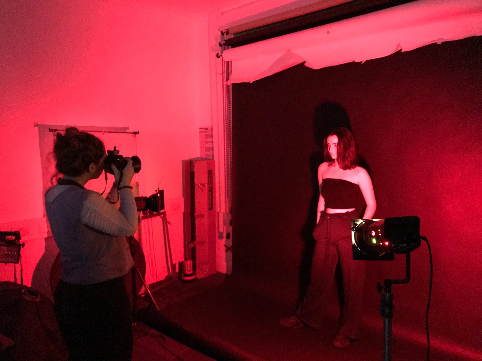
Our final product promotes the single release from the album by having a major star image, the artist is in every single shot making it obvious she is the one who created the single. Having the colour scheme of pink, blue and red makes the theme of the website and the digipak all the same, showing a pattern of her vibe and the message she is trying to send.

I have been empowered as a prosumer of media text by creating a whole new star image for a song which has already had a star image put to it. It has been so much fun creating an image for our star Honor and making her into anything we want through the conventions of media.

In the review of editing the final product, I have learned it is a very long process and you must only edit when you feel inspired. If you try and edit when you are uninspired you will do a poor job and make the video look bad. Post-production is my favourite part of a production, even though it was very frustrating at times, in the end, it is very satisfying.


Monday 27 November 2017

Fourth leg of editing

Miranda and I are close to finishing both of our rough cuts and have come together to discuss the finishing element, which is the skin element, where we will have to carefully place all the necessary footage in the final 20 seconds. We agreed that we would have a tracking shot pulling out of the tunnel element at the end of the video to finish it.

[VIDEO] of 20 sec. skin

Friday 24 November 2017

Drafting the website

Miranda mocked up a website for us, and I love the colour scheme of it already!!! The font will be worked on, because I feel it is too basic for her aurora, but she has done a good job.


The social media platforms are constantly shown at the bottom of the screen, which is very important, especially for an upcoming artist that will be relying on their social media for promotional purposes.


I love the idea of the jelly fish being in the background of the website. It goes with her vibe really well, but we would not be able to take our own pictures of jelly fish because we don't have the opportunity to shoot them.

First set of feedback

We showed a few people out rough cut and most of them liked it. Maya and Karina said that it was cool. Mike suggested that we should put the red scenes further into the video and bring it in to the chorus, instead of the first verse. Lily suggested to remove a shot of Honor lip syncing while smiling and that is quite shaky.

I sent the video to my Dad and he suggested that the shot of the eye blinking isn't very good because he has worked in the film industry for a while and they suggest that its a bad shot. He also said that we shouldn't focus so much on her hands. So in the glitches I feel we may have to change it from her touching her waist to her being more performance like.

Jason (our media teacher) was expecting the girl to be singing about a boy to 'ignite her', so he was shocked when he realised it was a girl at the end. He like the surprise tho, it is very unconventional.

Third Leg of Editing

We went into the editing suite today as a group and looked at the rough cut that Miranda made for us. It looked good, but there were a few bits that weren't in sync with the music, so we had to replace those with ones that were in sync.

We decided as a group that Miranda and I should create two different rough cuts and come together at the end of completing the video because we clash on some ideas, making it difficult to just keep to one rough cut.

I finally had the chance at editing the chorus with all the shadows, and it was harder than I thought it was going to be. You have to sync from one mid-shot to a close up with precision or then it looks messy and jolty. We got to the ending 20 seconds of the song and we are going to have the rough cut finished by the end of this week.

Album design mock up


This was my interpretation of how the front cover will look, with that type of font, keeping her music conventions the same throughout.


This would be the cover on the inside front of the digipak, having the same colour scheme as the music video, but not too obviously. Making the colour strips look like neon lights, like te music video.


The record page will be pretty simple, probably keeping to the same colour scheme too, but not having the artist in the picture behind.


The back page will have all the song names and will be peering through some more bars, which will keep to the electronic vibe of the digipak.

Monday 20 November 2017

Album Cover Design

Franek has been designing our album cover design and it looks fabulous!!!


For the front page, Franek decieded to keep the colour scheme similar to the music video, pink and blue, both colours matching pop genre conventions and their neon shade works perfectly with the electronic music convention, as our artist would be labelled as electronic pop. He decided to put our singers face on the front cover but manipulate it a bit by covering them with coloured strips that will be done in post production. Showing the face of our singer is important as it is her first album and audiences have to associate the music with her appearance to build her star image. Although we decided our artist should reach mass audiences and the mainstream media we also want to appeal to niche audiences. Distorting and covering it will be effective and will show she is not obsessed with her image but still wants to be recognised and cares about it.


He also thought about creating multiple plans on the picture, the first one would be the background, the second is the structure made out of fabric stitched and knotted together dipped in plaster. These structures could offer a dreamy, unsusal look and helps us achieve the surreal quality we want our artist to have, the third plan is the artists face and the fourth one would be the stripes of colour.


The shoot we will do for the album cover with show our artist facing us backwards with her hand leaning towards the camera, sitting on some type of cloth. She will be lit up with pink light and the background will be blue. In post production, we will add a glitch like effect around her body. Showing skin in tis shot not only relates to our fourth segment of the shoot, but is also an attempt to make the singer seem more vulnerable. It is an effort to contrast the cover which will show her in quite an intimidating way, showing both ways will help make her seem present yet absent. The glitches relate to her music being electronic and us as a group wanting to connote a sort of dreamy visual aesthetic.


The part of the CD digital is a way of showing something visually appealing and working with the overall aesthetics, trying to make things a bit less crowded and simple, to not confuse the potential buyer. It would feature Franek's textiles work in it too, and will be lit in a bright pink light too. The track list would feature the glitch effect that we were inspired by Abra's album cover. It would have the background with the texts in the middle and around it will be the glitches. It would related to the part of the CD with the singers back and it would be pretty simple but with a twist.

Friday 17 November 2017

Second leg of editing

Today I went back to the editing studio and reviewed what our group has edited so far. We have agreed that we will edit the intro after editing the rest of the video. Miranda made a huge impact on the editing, so we just worked around what she has done.


I specifically went into the editing suite during lunchtime to edit the lyrics in the song which are glitchy, and synchronize the footage with these lyrics. Here is what I edited:


I used the editing tool called the 'razor' to cut the clips in half and rearrange them to make this effect. I've come very acquainted with the short cuts on the key board, such as 'C' for the cutting tool and 'V' to go back to the mouse to move clips around. It becomes much easier to edit with these shortcuts.

To begin editing, I viewed clips of a certain segment and remembered certain times where their was a cool shot and that we would definitely use. We took it 10 seconds at a time, so we made sure that everything was precise and looked eye catching.

Thursday 16 November 2017

Sketching out our website design


Here is my interpretation of the website homepage. I want it to be quite colourful but simple, suggesting our star image's conventions well.


Here is another homepage I created. I like the idea of being non-conventional and having the menu bar on the side, just like Rihanna's website.


The music tab will be very basic and just have the album cover and a list of songs.


We will make up merch that she would be supposedly selling, using photoshop over the top of plain images like a t-shirt or a scarf.


The video tab will include the music video we produced, with a cool background to make it stand out.


Tour dates and locations will be placed here.


Here we will put photos I took on the day of the shoot, behind the scenes and pictures that we take from the shoot we are going to do with Honor for the album cover.

Wednesday 15 November 2017

Brain Storming for Website layout


I love this website design because it is also very simple, with Raye's name plastered as a border of the website, and every link is clearly visible, making it easy to navigate through the website. I also love the vibrancy of the colour of green.


Rihanna's website is also very cool, as you hover over the black and white pictures, they turn into colour, which I thought was a very cool concept. Having the contents page on the sidebar is also very useful.


Mabel also has a really cool website. I love the interpretation of the flowers in the background of her portrait. Her social media is also very clearly shown in the top right hand corner. She is also very conventional in the way that the font of her title 'Mabel' is the same font as all the other text on the page too.


Halsey's website is also very simple and effective. The portrait is very conventional of her star image, and the title is very bold like her personality. The website then slides down to the menu bar where you can see pictures and videos of her tour.


I like Stormzy's website design because it is very simple with an image, his name and album title. I can imagine Honor having a website similar to this, with maybe a picture of her lying on her side for her to be extended throughout the whole page.
https://stormzy.com

Are there any conventions on each of the webpages?

They all include a bio/about tab, music and video. Halsey and Rihanna both have merchandise websites, which is a further convention of really successful artists, reaching out to their fans by clothing and makeup. All of the websites shown above have their social media platforms clearly shown, suggesting that they rely heavily on social media for promotional values. Most people my age (17/18) will search for an artist through Instagram first, then find the website secondly through their Instagram page.

What sort of feature would we include?

We will include the main menu tabs; a portrait of the artist on the homepage; music and videos; a bio/about tab and social medias will be located on every sub page the viewer goes on. For the photos tab it will be displayed as a collage, and when you click on the picture it will expand into its full HD picture.

What style/design does your group want for the website?

The website would open with an image of Honor on the left, the menu tab will be on the top, Honor's name will be written boldly next to the picture of her, to make it eye catching. The music video will also be located on the homepage.